Showing posts with label photographing jewellery. Show all posts

Sunday, 25 August 2013

Sunday Confession - Natural Props

dried flowers and pine cones

I have a confession. I am addicted to collecting seed pods. It borders on the obsessive to the point where I can't walk past a front garden without scouting for potential loot and whenever I come back from a walk I leave a trail of black seeds in my wake.
In particular it is poppy seed pods. They are so fascinating. The variety of shapes are amazing. I was hooked from the day my dad showed me how to remove the 'hat' and pour out all the seeds.


And the colours. Purple, mauve, green, mint, terracotta, cream. Some are like little balls and some look like lanterns.
Of course I do have a use for them (if not for all 1000 of them). I electroform the best candidates - at least I will when I figure out how to make it safe with cats in the house.
And they make wonderful props for me jewellery shots. Having a few in shot not only looks nice, but also helps the camera find the right white balance - which means truer colours in my pictures.


Friday, 22 June 2012

Opinions Please

When you're selling online, the photographs you take of your designs is a really BIG deal. After all they are the only thing besides a wordy description that the buyer has to judge from before deciding what to buy.


I am always looking to improve my shots as a consequence, plus a client of mine expressed surprised at the colour of the earrings she received the other day. While she still loved them, it wasn't what she expected. 


I'd really like to avoid surprises like that.


So here I am again looking at backgrounds. I have more or less decided to now only shoot in natural light - an easy promise in summer. So now it would be good to find some background that not only complement the jewellery, but also helps the client judge the colour.


Etsy recommends always having at least one image of every item on a completely white background - that both suits the treasury makers and the magazines - it is so much easier for them to fit in your item amongst other featured things - and you want to encourage that.


But isn't plain white just a bit boring and rather stark? I'd like an alternative. The test here to the left I did to try out some variations. You can see where the camera has difficulty in getting the colour and contrast right. Too light a background and the details in the recessed areas just go all dark. Some of the colours also fools the camera in to making the silver appear yellow. Not sure why that is.
I think for the copper I've decided on the bottom paper. It's darker and so helps the details in the trees and it's not too green which helps the copper colour stay true. A bright green would really make the copper appear to orange-red.


The silver is a whole new issue. I've only recently started doing silver and the background I have so far have really not done the pieces justice.


I tried white, parchment and warm wood. Out of those the parchment shows the truest colour of the silver. I can adjust the others on the pc to make it better, but less work is after all less work :o)
Now rather confused, I went on Etsy to spy what other people do as a solution. So much silver on Etsy!
But most of them have white or grey backgrounds. There was a few which looks exceptionally nice on some kind of slate. I might see if I can get me some of that.
So it seems that it might be best not to use too much colour which overshadows the delicate greys of silver.
Off I was doing more test. Here's my new sheet:


I actually like most of these, but I'm not sure I can decide. Can you help me? Please let me know if you have a definite favourite.

Friday, 4 May 2012

Say Hello to my New Hand


This dainty model is helping me take better pictures of my bracelets. I have often heard that it is better to use live models, but I don’t have one available at my whim, that is, not one that has feminine hands and a dainty wrist :o)
I have tried using myself, but besides awkward angles when I’m trying to pose and manage the camera at the same time, I don’t make a great model. Having a kitten and creating wire jewellery often results in my hands looking like I just clawed my way out of a coffin after being buried under a bramble bush. I have spent hours ‘healing’ my hands in Photoshop, so that they wouldn’t distract from the jewellery.

Besides, when it comes to jewellery I think some people can get put off by seeing their one-of-a-kind piece of jewellery on somebody else’s wrist before they even received it.
So I got myself a helping hand. She arrived soot black which can be a bit harsh as a background so I sprayed her with a colour called fossil. Neutral but warm, which helps the camera and later me to identify which white balance to use to get the truest colours in the photo.


Studio Light

Getting nice shots is much easier now, and even if the hand is rather too dainty, it should still give a good idea of size in the shots and of how the piece will hang on your wrist. Should I give her a name? Manni?

Daylight

Sunday, 15 April 2012

New Copper Ring Designs


I find it quite hard to make rings, or rather, make rings that I like. Quite a lot of them feel far to chunky for me and if they're too intricate they might look gorgeous, but chances are they snag on clothing and such. I prefer my rings to be small and elegant, which I haven't quite managed to my satisfaction before.


Actually my main motivation to make rings lately have been to use one as a prop. You know how it is really difficult to gage the size of jewellery in those detailed close-ups? I've been searching for a prop that will go well in my shots and which gave shoppers a point of reference as to size. Coins and stamps can look neat in shot, but only Brits have a good sense of the size of a penny. So I thought a ring would be just right. While they vary a bit in size, I think they give a good reference.
I have made some sad attempts the last month, none of which I was happy with. They were hard to make and didn't look good in the end, but finally I had a breakthough.


I was playing around and arrived at the design above, which I am so pleased with. Might not be terribly original, but I think they look elegant and remind me of ferns unfurling.
The best part is that they can easily be varied so that each ring ends up being unique.


Now I can make rings to go with the earrings and I have the prop that I needed. Now to figure out how to place them in the shot without them stealing the attention :o)


Tuesday, 27 March 2012

Props for Shooting Jewellery


I thought I’d share some of my favourite props when taking shots at my jewellery. I consider three main issues when choosing props.  One: I think it important that whatever props you use, they have to be practical – I use them as holders, hooks and hangers. Two they are not allowed to steal the show or distract from the jewellery, so I like making sure they don’t have bright colours and usually shot them so they are not fully in the shot.. Third: They have to suit the jewellery and help tell the same story.

So my pieces are usually inspired by stories, fairytales and nature, which means props that come from nature, is an obvious choice. I love my conch and though I can’t remember where I got it, I have had it for ages and have used it often in drawings as well as photos. My little wind plant with moss is fairly new. I was looking for a dish with a rim so that I could stage some earring shots and came across this little fellow in just the right colours. Just beware that it’s a lie when they say wind plants don’t need taking care of (I killed the first one, shh).

The branch I got from my sister in law’s garden. She has two beautifully gnarly trees like this and they are perfect for hanging all sorts of things on. I’ve got some large branches too that I use for fairy lights and golden decorations at xmas time.

The ring is a quick homemade one I put together with a crystal and some bronze coloured wire. Not my greatest work but it serves one important purpose; it provides scale to some pieces, which is one of the hardest challenges when shooting jewellery I find. When I get really close up to show the details it often makes it really hard to judge an item’s size.

The tissue paper I use in almost every shot and it really helps tie the look of my store together. I bought a couple of coffee cups from a cafe and they came wrapped in this. I love the colour and the faint writing which reminds me of journals and maps – perfect for stories.
The brass cup is from a whole Turkish tea set I bought at a charity shop. I love treasure hunting in those stores and never feel guilt about spending money in there. After all it’s for a good purpose, I’m recycling the item and if I don’t use it I can always just give it back to the shop. I love these old things that makes me wonder where they came from and who their previous owner were.


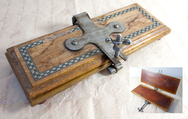
I just got a new item yesterday. I didn’t know what it was, but the look was just so wonderful. The old wood, the worn of checker pattern and that fantastic steel screw. When I got home I realised it must be a flower press and discovered that the steel is from Sheffield. That just makes it even more perfect. I have given it a good wash and some polish and hopefully I can give it some good use as a prop.